Project Over View
The Product
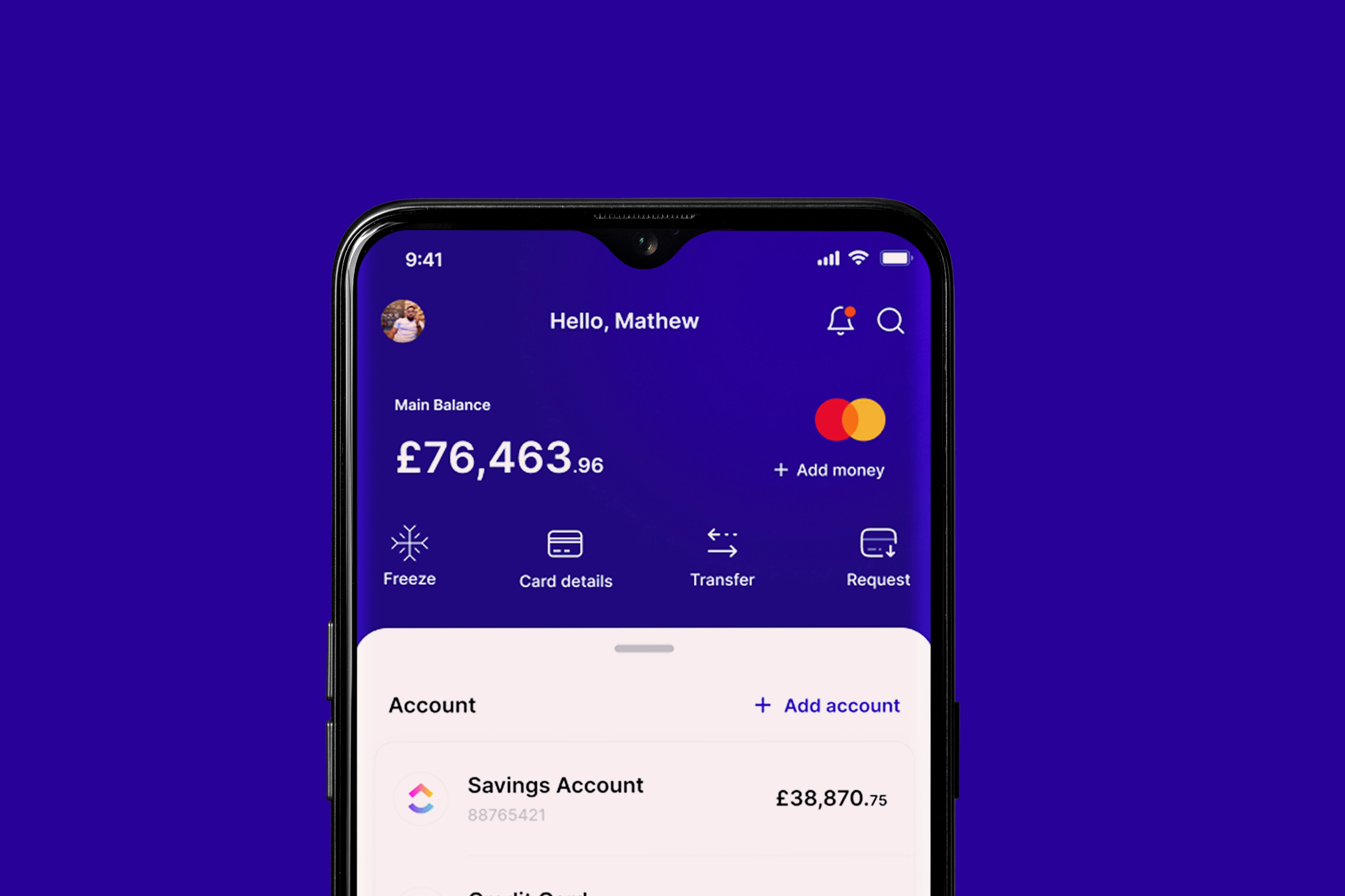
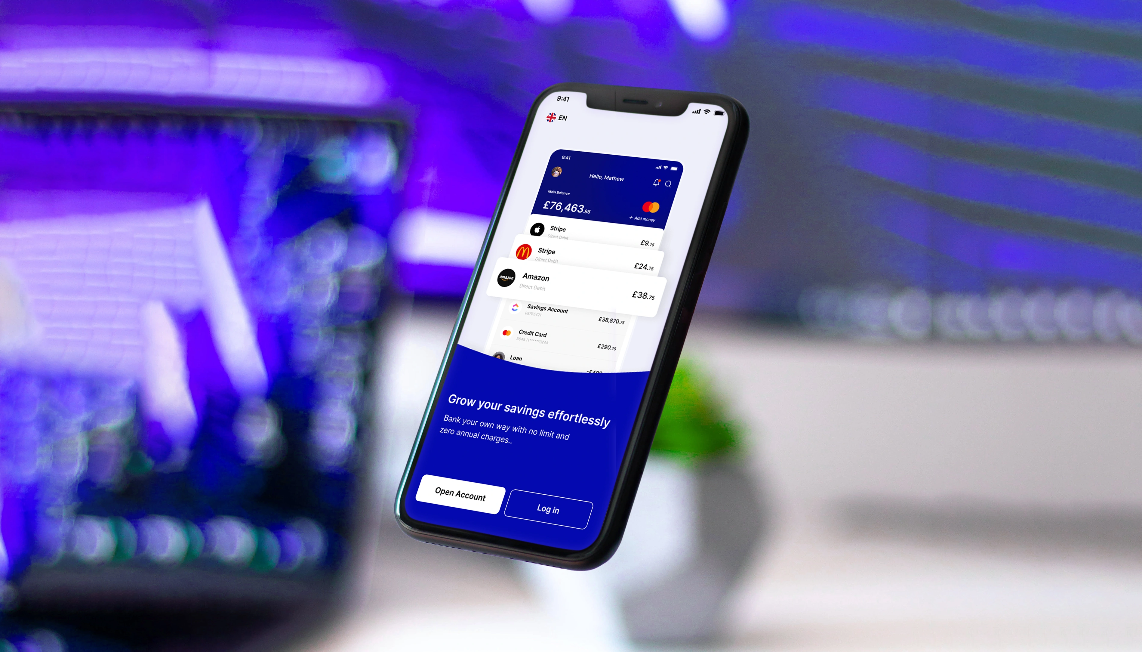
SwiftPay is a cutting-edge online banking application designed to provide users with a seamless and secure financial management experience. With its user-friendly interface, advanced features, and robust security measures, SwiftPay is the ideal solution for individuals and businesses seeking a modern and efficient way to manage their finances.
My Role
Senior UX/UI Designer
My Responsibility
Objectives
Project Goal Outline
Enhance User Experience:
A. Improve Interface:
Conduct user survey and feedback analysis.
Implement a more intuituve and user-friendly design.
Optimise navigation for a seamless user experience
B.Accessibility:
Ensure compatibility across various devices and platforms.
Implement features to enhance accessibility for users with disabilities.
Conduct usability testing to identify and address any user experience pain points
C. Account Integration:
Increase the number of supported banks and financial institutions.
Enhance the synchronisation of account data for accuracy.
Explore partneship for seasmless integration with external financial tools
D. Advanced Budgeting Tools:
Develop and implement advanced budgeting features.
Provide personalized financial insights and recommendations.
Enable users to set and track specific financial goals within the app.
E. Payment Flexibility:
Integrate additional payment methods (e.g, digital wallets)
Streamline bill payment processess for increased efficiency.
App Preview
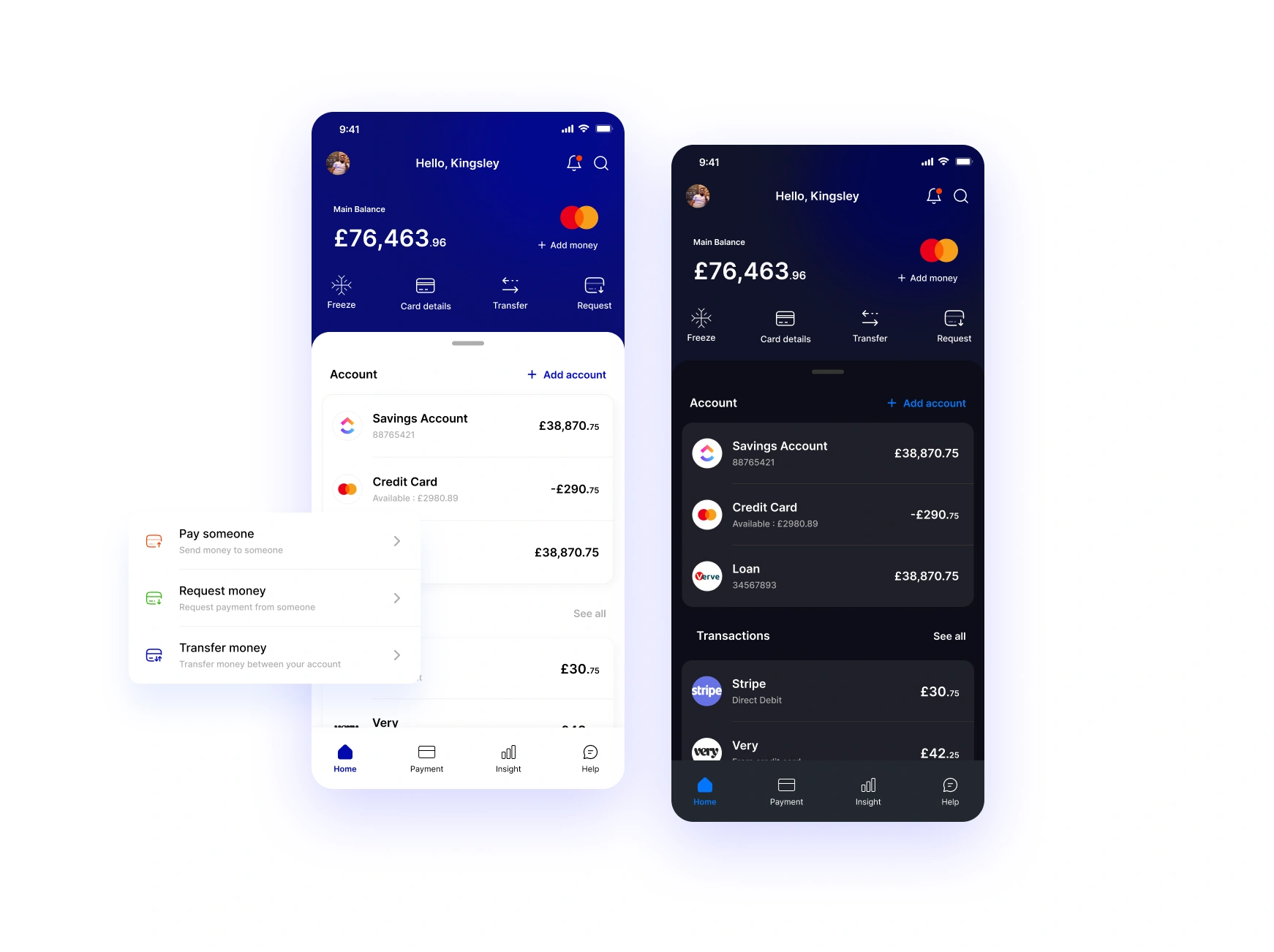
Live Figma Prototype
Try the live figma prototype of the app
From the prototype you can have a first approach experience of the overall app functionality and process of operation.
Usability Testing
Redesign User Interface Feedback
Objective: The primary objective of the usability study is to evaluate the redesigned user interface and features of the SwiftPay banking app to ensure that it provides a satisfying user experience.
Participants: I organised a diverse group of 35 participants representing the target audience of the SwiftPay app, including both genders and a mix of age groups.
Date and Location: The usability study took place over the course of four week on Microsoft Teams meeting. Testing sessions was scheduled from 2nd Feb - 1st March 2022.
Study Facilitators: The study was facilitated by Mathew, David, Seun and Ifeoluwa.
Updates Based on Feedback
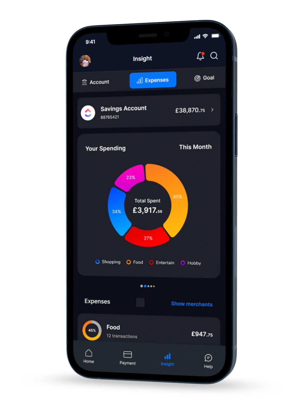
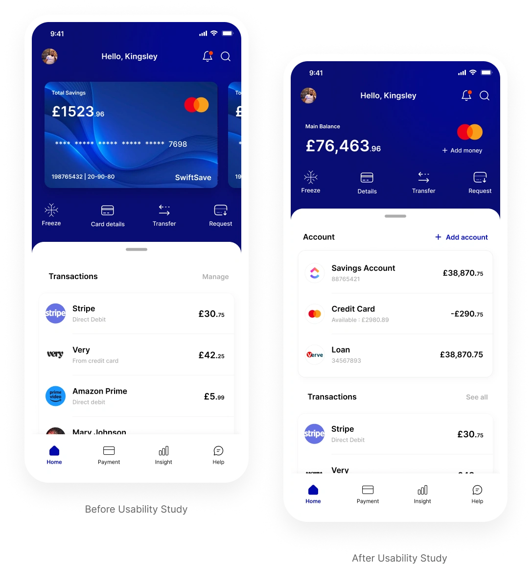
Different Account Display
Problem:
Users frequently misunderstand the card-swiping function designed to display the balance on each account. This has led to confusion, particularly given the importance of this feature within the app.
Solution:
To address this issue, i have to redesign the home page to display all the different account users have on the app or have synced from another account into the swiftpay app. This solution aims to improve user experience and reduce confusion when managing multiple accounts.
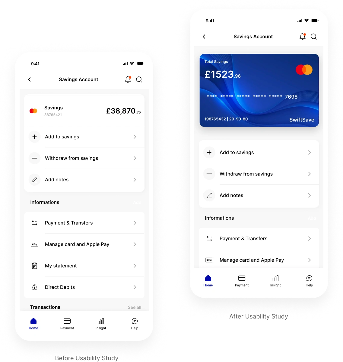
Savings Account Display
Problem:
After testing how people use SwiftPay, we found that users had trouble with the way savings accounts are shown. It was hard for them to understand and get the information they needed about their savings accounts, making it a bit frustrating.
Solution:
To make things better, I changed how savings accounts are displayed in SwiftPay. I simplified how it looks, making account balance labels clearer, and adding easy-to-understand signs. Users will find it easier to manage and get information about their savings.
Simplifying the payment page
Problem:
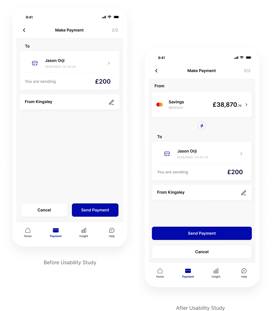
Following the usability test on the SwiftPay app, a significant issue emerged regarding the payment page. Users struggled to identify the specific account from which they were sending money at the final payment page.
Solution:
To address this problem, a solution was devised to simplify the payment page. Now, users can clearly see and select the account from which they are sending money at any stage during the payment process. A visual indicator and clear labelling was also added to highlight the chosen account.
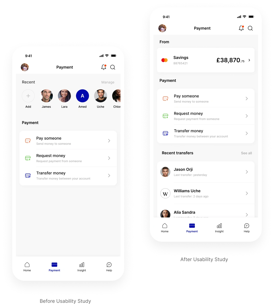
Simplifying the recent payment display
Problem:
Users most times struggle to understand that the recent transfer area scrolls horizontally and secondly they were unable to also view the particular account they are sending money from.
Solution:
To address this problem, a solution was devised to simplify the payment page. Now, users can clearly see and select the account from which they are sending money and also scroll vertically to see their recent transfers or any account they have marked as favourite.
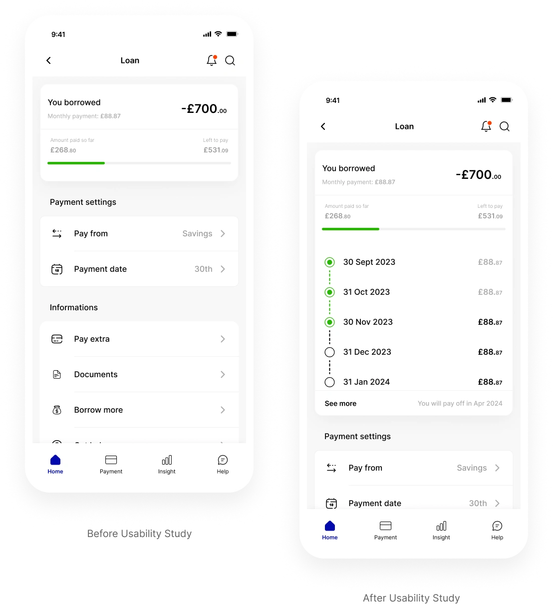
Loan repayment progress
Problem:
Prior to the usability test, users indicated they would like to see more intuitive progress on their past loan repayment each month.
Solution:
We needed to adjust the initial design of the loan repayment progress by emphasising the 30th or 31st day of the month to illustrate the amount paid and the remaining balance.

Updates Based on Feedback
Different Account Display
Problem:
Users frequently misunderstand the card-swiping function designed to display the balance on each account. This has led to confusion, particularly given the importance of this feature within the app.
Solution:
To address this issue, i have to redesign the home page to display all the different account users have on the app or have synced from another account into the swiftpay app. This solution aims to improve user experience and reduce confusion when managing multiple accounts.

Savings Account Display
Problem:
After testing how people use SwiftPay, we found that users had trouble with the way savings accounts are shown. It was hard for them to understand and get the information they needed about their savings accounts, making it a bit frustrating.
Solution:
To make things better, I changed how savings accounts are displayed in SwiftPay. I simplified how it looks, making account balance labels clearer, and adding easy-to-understand signs. Users will find it easier to manage and get information about their savings.

Simplifying the payment page
Problem:
Following the usability test on the SwiftPay app, a significant issue emerged regarding the payment page. Users struggled to identify the specific account from which they were sending money at the final payment page.
Solution:
To address this problem, a solution was devised to simplify the payment page. Now, users can clearly see and select the account from which they are sending money at any stage during the payment process. A visual indicator and clear labelling was also added to highlight the chosen account.

Simplifying the recent payment display
Problem:
Users most times struggle to understand that the recent transfer area scrolls horizontally and secondly they were unable to also view the particular account they are sending money from.
Solution:
To address this problem, a solution was devised to simplify the payment page. Now, users can clearly see and select the account from which they are sending money and also scroll vertically to see their recent transfers or any account they have marked as favourite.

Loan repayment progress
Problem:
Prior to the usability test, users indicated they would like to see more intuitive progress on their past loan repayment each month.
Solution:
We needed to adjust the initial design of the loan repayment progress by emphasising the 30th or 31st day of the month to illustrate the amount paid and the remaining balance.
